HTML Layout
HTML Layout Elements
Websites often display content in multiple columns (like a magazine or newspaper). HTML offers several semantic elements that define the different parts of a web page:
<header>- Defines a header for a document or a section<nav>- Defines a container for navigation links<section>- Defines a section in a document<article>- Defines an independent self-contained article<aside>- Defines content aside from the content (like a sidebar)<footer>- Defines a footer for a document or a section<details>- Defines additional details<summary>- Defines a heading for the <details> element
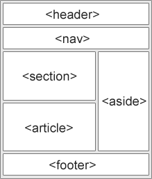
Fig. Semantic HTML markup
HTML Layout Techniques
There are five different ways to create multicolumn layouts. Each way has its pros and cons:
- HTML tables (not recommended)
- CSS float property
- CSS flexbox
- CSS framework
- CSS grid
HTML Tables
The <table> element was not designed to be a layout tool! The purpose of the <table> element is to display tabular data. So, do not use tables for your page layout! They will bring a mess into your code. And imagine how hard it will be to redesign your site after a couple of months.
CSS Floats
It is common to do entire web layouts using the CSS float property. Float is easy to learn - you just need to remember how the float and clear properties work. Disadvantages: Floating elements are tied to the document flow, which may harm the flexibility.
CSS Flexbox
Use of flexbox ensures that elements behave predictably when the page layout must accommodate different screen sizes and different display devices. Disadvantages: Does not work in IE10 and earlier.
CSS Grid View
The CSS Grid Layout Module offers a grid-based layout system, with rows and columns, making it easier to design web pages without having to use floats and positioning. Disadvantages: Does not work in IE nor in Edge 15 and earlier.
learn more about CSS Grid View
Example: HTML layout with CSS float
1 2 3 4 5 6 7 8 9 10 11 12 13 14 15 16 17 18 19 20 21 22 23 24 25 26 27 28 29 30 31 32 33 34 35 36 37 38 39 40 41 42 43 44 45 46 47 48 49 50 51 52 53 54 55 56 57 58 59 60 61 62 63 64 65 66 67 68 69 70 71 72 73 74 75 76 77 78 79 80 81 82 83 84 85 86 87 88 89 90 91 92 93 94 95 96 97 98 99 100 101 102 103 104 105 106 107 108 109 | <!DOCTYPE html>
<html lang="en">
<head>
<title>CSS Template</title>
<meta charset="utf-8">
<meta name="viewport" content="width=device-width, initial-scale=1">
<style>
* {
box-sizing: border-box;
}
body {
font-family: Arial, Helvetica, sans-serif;
}
/* Style the header */
header {
background-color: #666;
padding: 30px;
text-align: center;
font-size: 35px;
color: white;
}
/* Create two columns/boxes that floats next to each other */
nav {
float: left;
width: 30%;
height: 300px; /* only for demonstration, should be removed */
background: #ccc;
padding: 20px;
}
/* Style the list inside the menu */
nav ul {
list-style-type: none;
padding: 0;
}
article {
float: left;
padding: 20px;
width: 70%;
background-color: #f1f1f1;
height: 300px; /* only for demonstration, should be removed */
}
/* Clear floats after the columns */
section:after {
content: "";
display: table;
clear: both;
}
/* Style the footer */
footer {
background-color: #777;
padding: 10px;
text-align: center;
color: white;
}
/* Responsive layout - makes the two columns/boxes stack on top of each other instead of next to each other, on small screens */
@media (max-width: 600px) {
nav, article {
width: 100%;
height: auto;
}
}
</style>
</head>
<body>
<h2>CSS Layout Float</h2>
<p>
In this example, we have created a header, two columns/boxes and a footer. On smaller screens,
the columns will stack on top of each other.
</p>
<p>
Resize the browser window to see the responsive effect (you will learn more about this in our
next chapter - HTML Responsive.)
</p>
<header>
<h2>Cities</h2>
</header>
<section>
<nav>
<ul>
<li><a href="#">London</a></li>
<li><a href="#">Paris</a></li>
<li><a href="#">Tokyo</a></li>
</ul>
</nav>
<article>
<h1>London</h1>
<p>London is the capital city of England. It is the most populous city in the United Kingdom, with a metropolitan area of over 13 million inhabitants.</p>
<p>Standing on the River Thames, London has been a major settlement for two millennia, its history going back to its founding by the Romans, who named it Londinium.</p>
</article>
</section>
<footer>
<p>Footer</p>
</footer>
</body>
</html>
|